

Snug Dope Decor - Expert commentary from Emma Bestley, Creative Director & Co-Founder, YesColours
Where do we start?
“We all have such different emotional reactions to hues and tones of colour, the first question is; what colours on the colour wheel are you drawn to and if so; what colours make you feel good and joyful when you see them in a public space like a shop, cafe or if we wear them or seeing those colours on other people or even spotting homeware accessories on a shelf. This is the colour you need to surround yourself with, a colour you feel comfortable with, makes you smile and / or gives you energy.
For a real boost, it’s often a saturated shade of colour which will give you that burst of energy, like a deeper yellow, or a lush green, an oceanic teal or a warm orange but you just have to be mindful whether your walls can handle that depth of saturation.
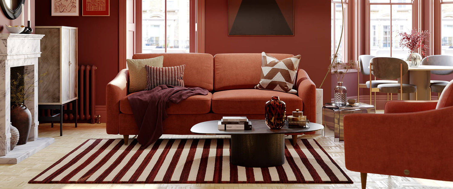
Another way to bring that dopamine hit into your home can be via colour clashing - it adds a fun, uplifting backdrop to an interior space. You can either choose to make a statement with rich bold colours or tone it down a little with a softer tonal palette. Colour blocking is regularly seen and experimented with in fashion and the same creative twist can be applied to your home. To ease yourself in, try experimenting with a few homeware accessories, it’s a great way to see if colour clashing is for you. Remember, you can always tone a colour scheme down by incorporating one or two neutrals.”
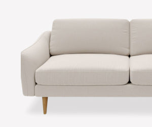
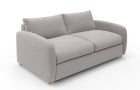
image coutesy of @homewithhelenandco on Instagram
Which colours should I pick?
“Multiple colour options provide infinite possibilities and give each space in your home identity. If an energetic feel is what you would like to achieve, opt for bold vibrant colours on the complimentary wheel. This could be Navy and Peach, Pinky hues paired with Green or optimistic Yellows and Lilacs. The eye instantly recognises these contrasts, creating a dramatic and powerful look.
Using colour proudly and playfully will evoke feelings of happiness, allowing you to express your personality. We've seen a huge interest in the Wes Anderson effect, with consumers using Peaches and Pinks alongside olive Greens, vibrant Aquas and plummy Pinks. Contrasts and expressive combinations lend itself to rooms of pure delight.
We have witnessed an array of unique and exciting colour pairings recently; Electric Blue and Fresh Peach have been a popular choice. Whether it’s a Miami vibe or inspiration from Marrakech, consumers are enjoying a zingy shade together with a pastel, to create a strong bold look with zonal areas."
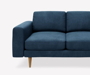
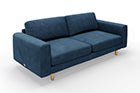
image coutesy of @househomo on Instagram
What is your no.1 choice of colour for a dopmaine hit?
"The top colour in our mood-boosting list is, surprise - yellow! Yellow is the colour that represents the sun - the key thing we're all missing during autumn and winter. The solution? Paint your space yellow, of course. Look into our Fresh Yellow and Calming Yellow paint colours - they have the positive feeling that yellow evokes, but at the same time are muted and balanced enough to not overwhelm your walls (and your brain too).
Any type of grey or crisp, bright white colour will add even more cold tones to your space, while the ultimate goal for the darker months is, in fact, to bring warmth into your home. The same applies to cooler blue shades, so if blue is your go-to colour, make sure the paint you pick has warm undertones to it - they will absorb the natural light coming through the windows and spread it across the room like a warm hug."
Any tips for painting with a bold colour?
“Delight your senses with a playful splash of colour on the walls or ceiling. It’s amazing what a difference an accent wall can make. It could be exactly what your room is missing, the flash of bold colour helps to anchor the entire scheme and with just 1 litre of paint, you’ll be able to cover two coats on a 3x2m wall. So easy to you could do it in your lunch break!”
I’m new to colour! Any tips on how to introduce it gently into your interior scheme?
“Create a little zone of colour in one section of the house; try a bold colour around shoe or coat rack area or an energising splash of colour near a desk space, these pockets of paint will bring the area to life and are great at zoning the space in compact or open plan spaces.”